For Onlinecourses55
|
2026-10-11
For Onlinecourses55
|
2026-10-11
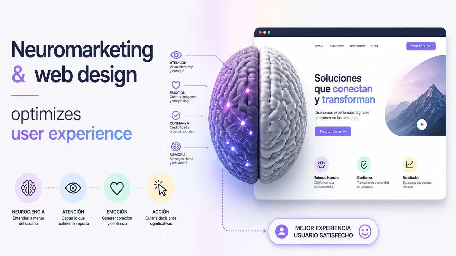
Neuromarketing & web design optimizes user experience - neuromarketing
To boost user satisfaction and streamline design, implementing neuromarketing principles can be transformative; join this course focused on user experience optimization and learn to create better online interactions.
Neuromarketing studies how the brain reacts to marketing stimuli. By applying its principles to web design we can anticipate decisions, reduce friction and increase satisfaction. Understanding emotions, attention and memory allows us to create experiences that connect more naturally with the visitor. It is not about manipulation, but about designing with empathy, using visual and structural cues that facilitate decision making.
Human attention is limited. A clear visual hierarchy guides the eye to what is important. Contrasts, size and white space help prioritize elements without overloading the user.
Emotions drive action. Images that generate empathy and messages that appeal to basic needs -security, belonging, achievement- increase conversion. A human, relatable tone builds trust.
Designing for recall implies consistency. Repeated patterns, consistent use of colors and a clear visual identity facilitate brand recall in the future.
Reducing steps and simplifying options avoids overload. Short forms, linear processes and clarifying microcopy reduce friction and abandonment.
Organizing content according to user expectations is essential. Menus, page structure and conversion paths should reflect real tasks. A good navigation map and visible calls to action guide without confusing. It is advisable to design paths of least resistance that lead to concrete goals, such as buying, subscribing or requesting information. Consistency between pages maintains the pace of exploration and avoids breaks in the experience.
Colors influence perceptions and moods. Choosing palettes that support the value proposition and respect contrast improves legibility and accessibility. Typography conveys personality; clean typography makes on-screen reading easier. Visual cues, such as icons and prominent buttons, guide to immediate action. It is important to test combinations to avoid ambiguity and ensure that the design communicates clearly.
Microinteractions communicate status and response. Subtle animations on hover, confirmations on form submission and smooth transitions provide a sense of control. Calls to action should be clear, concrete and easy to identify. Using action-oriented verbs and maintaining sufficient contrast with the background improves performance. It is also useful to employ A/B testing to learn which wording and aesthetics convert best.
Integrating analytics and user studies allows for iterative improvement. A/B testing, heat maps and session recordings reveal friction points and actual behaviors. Qualitative feedback, through short surveys or interviews, complements quantitative metrics. With these tools, it is possible to validate neuromarketing-inspired hypotheses and adapt the design according to concrete results.
Applying techniques that influence behavior requires responsibility. Designing to enhance the experience should not infringe on user autonomy. In addition, accessibility broadens the audience and reinforces usability: alternative texts, semantic structures and appropriate contrasts are practices that also reinforce trust and brand reputation.
Focus the message on a clear benefit, use a visible button and reduce secondary options to guide conversion.
Ask for as little information as possible, break the process into steps and show progress to reduce abandonment.
Use images that show actual usage, highlight benefits versus features, and add short testimonials to reinforce trust.
Communicate security, offer clear payment options and reduce additional cost surprises.
Combine behavioral insights with good web design practices to build more effective and human experiences. By focusing on real needs, validating with data and respecting user autonomy, sustainable results are achieved. Small adjustments in structure, language and visual cues can generate big improvements in satisfaction and conversion. Design with intent, measure and adjust is the route to delivering experiences that truly add value.
Start by defining clear, measurable objectives before touching design. Prioritize hypotheses based on data and qualitative observations. Design small solutions and conduct controlled tests to assess impact. An agile cycle of experimentation includes identifying the problem, proposing alternatives, implementing a variant and measuring results with relevant metrics such as conversion rate, time on page or bounce rate. It documents learnings and avoids massive changes without validation. In addition, involve stakeholders from early stages to align expectations and obtain feedback that complements quantitative data. Also consider segmenting audiences to customize experiences according to behaviors and context; what works for one segment may not be optimal for another. Finally, prioritize improvements that provide short-term value and build technical capacity to iterate continuously. Also measure satisfaction indicators to capture real user perception and adjust based on results and feedback.
There are analytics and testing tools that make it easy to apply these principles without large initial investments. Heat maps such as Hotjar or Crazy Egg show where attention is focused; A/B testing platforms such as Google Optimize or VWO allow controlled validation of changes; and analytics tools such as Google Analytics or Mixpanel provide metrics to prioritize improvements. For remote user testing, there are services that allow you to record sessions and collect direct feedback. Complement these solutions with internal documentation and reusable design patterns that accelerate future iterations. Finally, train teams in basic consumer psychology and usability concepts: understanding why people act in a certain way is as important as knowing how to measure it. Integrating these elements into the workflow creates sustainable improvement cycles that improve both user experience and business results.
Search
Popular searches