ForOnlinecourses55

The psychology of typography: what your fonts say about your business - psychology marketing
Before anyone reads a single word of your message, their brain is already forming an impression from the typography. The shapes, weight, curves and structure of the letters trigger automatic associations: seriousness, friendliness, innovation, tradition or fun. Understanding that psychology is not an aesthetic luxury; it is a strategic tool to build trust, guide attention and reinforce your positioning. Choosing a typeface is, in reality, choosing a voice for your brand.
Typefaces act as a cognitive shortcut. In milliseconds, the reader infers the tone and intention of the message: what in copywriting requires paragraphs, in design is suggested with microscopic details. An appropriate typeface reduces reading friction, makes content seem more credible and helps memory last longer. An inappropriate choice, on the other hand, adds noise, conveys inconsistency or causes unnecessary effort.
Serifs evoke tradition, stability and authority. They work well when you want to project heritage, rigor or a handcrafted attention to detail. In printed body text they are very comfortable; in digital, modern serifs with subtle serifs maintain good legibility. Useful for law firms, consultancy, higher education and legacy brands.
Clean, contemporary and direct. They convey clarity, efficiency and openness. Grotesque or geometric sans suggest precision and technology; humanist sans bring warmth and accessibility. They are a safe bet for interfaces, digital products, startups and clear communication across multiple screen sizes.
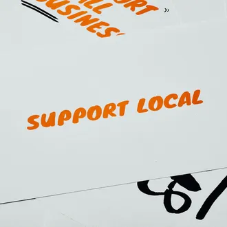
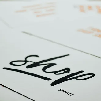
They associate closeness, creativity and a human touch. They work better in headlines and accents, not in long paragraphs. They give character to artisanal brands, events, beauty and gastronomy, provided legibility is maintained and there is sufficient contrast with the background.
Designed to impact and be memorable. They can be original, expressive or experimental. Use them sparingly in titles or campaigns. When overused, the message becomes heavy and loses seriousness, but in the right doses they create instant differentiation.
Linked to the world of code, engineering and transparency. They convey precision and a technical air. They are ideal for highlighting data, code snippets or for brands that want to emphasize honesty and functionality.
Opt for humanist sans serifs for accessibility and warmth, or geometric ones if you seek a more precise aesthetic. Prioritize families with multiple weights to build clear hierarchies in interfaces and content.
Contemporary or transitional serifs communicate credibility and rigor. Avoid scripts and flashy displays. Pay attention to line height and high contrast to reinforce seriousness and trust.
Soft sans serifs or humanist serifs reflect care and closeness. Avoid extremes: neither too clinical nor excessively playful. Think about legibility for diverse audiences and possible visual impairments.
Elegant high-contrast serifs or minimalist sans with plenty of air in the design. The key is refinement, proportion and white space to convey exclusivity.
Humanist sans serifs balance clarity and warmth. Combined with a friendly typographic hierarchy, they guide without imposing. Accessibility is a priority: generous sizes and good contrast.
Combinations of serifs with restrained scripts can suggest artisanality and flavor. In modern proposals, a clean sans serif with good color conveys freshness and food safety.
Combining two families is usually enough: one for headlines and another for the body. Seek contrast in form (serif + sans serif), weight (light vs bold) or width (condensed vs regular), but maintain a throughline, such as similarity in x-height or rhythm.
Color alters emotional tone: dark tones add seriousness; vivid palettes communicate energy; soft colors convey calm. Beyond color, micro-adjustments make the difference.
Responsible design considers all people and contexts of use. Ensure sufficient contrast between text and background, adequate minimum sizes and clarity in numbers and similar characters. Consider fonts compatible with low-resolution screens and review behavior across different browsers and systems.
Don’t rely on intuition alone. Turn the choice into measurable hypotheses and reduce subjectivity. An iterative approach saves costs and improves results.
Typography is not just aesthetics; it is strategy, behavior and perception. Choosing well can raise credibility, shorten the time to understand and strengthen recall. Choosing poorly, on the other hand, introduces friction and doubt. Think of typography as a system: families, hierarchies, spacing, color and accessibility working together to project your business’s promise. When that visual voice aligns with your values and your audience’s expectations, the message comes through without noise and the brand is recognized even before it’s read.