For Onlinecourses55
|
2026-10-06
For Onlinecourses55
|
2026-10-06
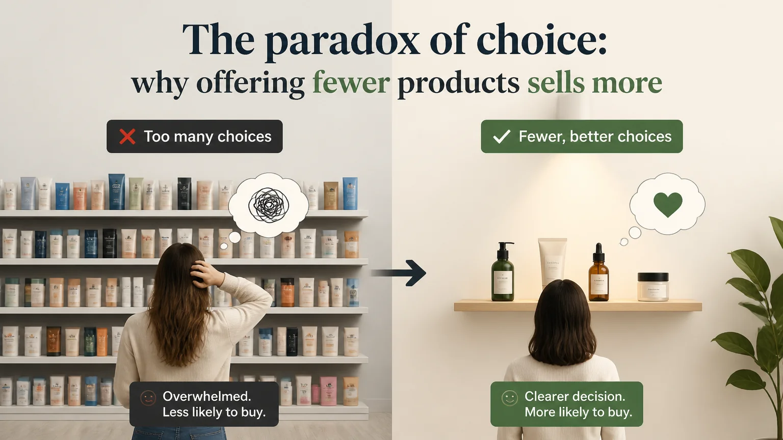
The paradox of choice: why offering fewer products sells more - psychology marketing
To get insights into simplifying decision-making for consumers, a highly relevant course on effective marketing psychology could provide valuable techniques.
When a person faces too many alternatives, their brain enters an endless evaluation mode. Each option opens the door to potential losses, to doubt about whether something better exists, and to the threat of regret. That mix of cognitive cost, fear of making a mistake and constant comparison causes many decisions to be postponed or simply not made. Reducing the number of options does not impoverish the experience; it makes it clearer. Instead of diluting attention among dozens of possibilities, it concentrates it on a few that are better explained, better presented and aligned with real needs.
Classic store experiments showed that when displays had many varieties, more people stopped to look, but fewer ended up buying than when a small, curated selection was presented. That pattern has repeated in contexts such as software plans, restaurant menus and retail catalogs: abundance draws the eye, simplicity drives action. Hick's law also indicates that decision time increases with the number of options, a pattern observed both in labs and in user experience tests.
In real A/B tests, reducing visible variants, highlighting a recommended product or moving from five plans to three usually increases conversion rate and shortens time to purchase. It's not magic, it's eliminated cognitive friction. The key is simplifying without removing value: offer few options, but good ones, and present them with extreme clarity.
Instead of listing everything that exists, group and prioritize what solves concrete problems. Think in terms of jobs to be done: “for beginners who want to start today,” “for performance,” “for tight budgets.” Keep catalog depth behind filters or product pages, but guide the majority toward three or four main routes. This shift of focus —from specifications to outcomes— cuts noise without cutting value.
Many brands show all combinations at first impact. Better: show the three most demanded variants and leave a “see more” for the rest. For colors, sizes or capacities, set a default option and a short selection. This preserves breadth for those who need it, but avoids overwhelming those who just want a solid recommendation.
People accept the default option more often when it is well justified. Define a “perfect balance” with an honest label like “most chosen” or “best value-for-money.” Accompany it with a concrete explanation: what it includes, who it’s for and why it’s the safe choice. Defaults reduce comparison effort and shorten the path to decision.
Bundles ease the anxiety of forgetting something important. Offer “starter”, “pro” or “gift” kits that combine the essentials and save the task of assembling the purchase. In services, create assistants that ask simple questions and lead to a recommendation. Short guides like “if you’re looking for X, choose Y” replace dozens of listings with a guided experience.
Progressive disclosure consists of showing the basics first and revealing details when needed. Structure the journey in steps: category, use, price range, then refinement. Avoid excessive filters; three to five well-chosen criteria are usually enough. Sort by relevance and quality rather than price, so as not to push defensive decisions that reduce perceived value.
Comparison needs context. Design three levels with clear roles: basic (performs reliably), recommended (balance), advanced (for demanding needs). a higher anchor helps position the value of the middle level; it’s not about pushing the expensive option, but providing reference. Avoid having two options compete with no clear difference; each level should “dominate” on a distinct criterion.
Instead of extensive tables, use brief messages that summarize key benefits and decisive differences: who it’s for, what problem it solves and what the person gains. Microcopy like “ideal for X,” “hassle-free setup” or “priority support” reduces doubts. Fewer bullets, more precision; less jargon, more results-oriented language.
A coffee shop with more than thirty origins reorganized its offering into six flavor profiles with a highlighted option per profile. Product visits fell, but purchases rose and decision time was cut in half. A restaurant cut its menu in half and structured the rest into “classics,” “vegetable” and “seasonal”; average checks increased by making pairings and recommendations more visible. A fitness app went from twelve plans to three goal-based guided paths; retention and adherence improved because people knew exactly where to start.
Choosing should feel like moving forward, not like carrying a backpack of doubts. When you present less, explain better and accompany the decision, you turn a catalog into a clear promise. Start by cutting the noise, providing context with a few well-differentiated levels and offering a recommended path. Simplicity doesn’t sell less; it sells with more confidence, faster and with greater value for everyone.