ForOnlinecourses55
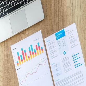
resume design: how to achieve a professional look without being a designer - cv creation
In today’s competitive job market, a well-designed resume is essential to stand out from the crowd. But what if you don’t have graphic design skills? Don’t worry. This article will guide you step by step to create a resume with a professional and attractive appearance, even if you’re not a design expert. You will learn to use simple tools and strategies that will allow you to present your experience and skills in the best possible way.
The design of your resume is the first impression you make on a potential employer. A well-structured and visually appealing resume communicates professionalism, attention to detail, and organization. It’s not just about listing your work experience, but presenting it in a way that captures the recruiter’s attention and highlights your strengths. A careless design, with formatting errors or an outdated appearance, can seriously harm your chances, even if you have an impeccable track record.
Think of your resume as a personal marketing tool. Just as a product needs good packaging to attract consumers, your resume needs an attractive design to capture recruiters’ attention. A well-thought-out design shows that you take your career seriously and care about how you present your information.
Fortunately, you don’t need to be a graphic designer to create a professional resume. There are numerous online tools that offer predesigned templates, intuitive interfaces, and drag-and-drop features that make the process easy. These tools allow you to customize your resume design without needing advanced technical knowledge.
Even if you use an online tool, it’s important to keep some basic design principles in mind to ensure your resume looks professional and makes a good impression.
Typography is a fundamental design element. Avoid extravagant or hard-to-read fonts. Opt for classic fonts like Arial, Helvetica, Calibri, or Times New Roman for body text, and you can use a slightly more distinctive font for headings, but always maintain legibility. Limit the number of fonts to two or three at most.
Color use should be moderate and strategic. Avoid bright or garish colors that may distract the reader. Use a neutral color palette such as white, gray, black, and navy blue, and add a touch of color (like a light blue or a soft green) to highlight important elements such as headings or sections.
White space (also known as negative space) is as important as content. It allows the eye to rest and makes reading easier. Avoid overloading your resume with too much information or graphic elements. Leave enough space between sections and paragraphs so the design can breathe.
Organize your resume logically and hierarchically. Use headings and subheadings to divide information into clear, easy-to-find sections. Highlight key points with bullets or bold text. Use a consistent layout throughout the document.
Online tools offer a wide variety of resume templates for different profiles and professional sectors. Before choosing a template, consider your work experience, your skills, and the type of job you are seeking. Choose a template that fits your personality and highlights your strengths.
Even when using a template, it’s important to avoid some common design mistakes that can damage the image of your resume.
As mentioned earlier, avoid excessive use of color or extravagant fonts. A cluttered design can distract the reader and make reading difficult.
If you decide to include a photo on your resume, make sure it is high resolution and looks professional. Avoid informal or low-quality photos.
Spelling and grammar errors are unforgivable. Proofread your resume carefully before sending it to any company. Use a spell checker and ask someone else to review it as well.
Include only information relevant to the position you are applying for. Avoid exaggerating your skills or achievements. Be honest and accurate in describing your work experience.