For Onlinecourses55
|
2026-07-23
For Onlinecourses55
|
2026-07-23

Visual hierarchy and reading patterns in web design - psychology marketing
Understanding visual hierarchy is essential for marketers, and you can explore this in detail through an enriching course dedicated to psychological principles in marketing and design.
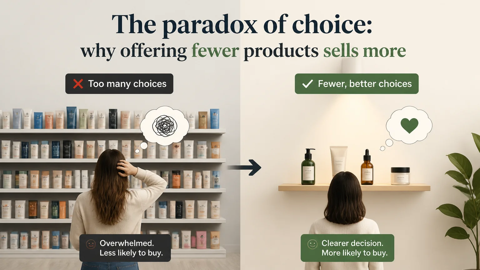
When a person lands on a page, they don't read every word; they scan. In milliseconds they decide whether to stay, what to look at and where to click. The way you arrange sizes, colors, spacing and placement guides those eyes and, with them, guides decisions. A good visual hierarchy reduces friction, highlights what matters and builds trust. A poor hierarchy, on the other hand, forces people to think too much, scatters attention and sinks conversions.
The goal is simple: lead the eye step by step through the key information, with clear signals in the right order. That is achieved by combining visual principles and understanding how we read on screens.
Before designing, decide what is most important, important and secondary. If everything shouts, nothing is heard. Define a narrative: entry point, support, detail and action. That story should remain consistent throughout the page.
The eye follows contrasts and changes. Alternating dense blocks with breaths, and large elements with small ones, creates a rhythm that guides effortlessly. Think of the page as a score: rests (space) and accents (contrast) mark the reading tempo.
Large elements are perceived first. Bold and high-contrast elements are too. Use sizes and weights to create levels: headline, subheadline, body text, note. Contrast is not only about color; it can be shape, texture or space. The greater the difference, the higher the priority.
Elements that are close appear related; separate what is distinct and group what belongs together. Clean alignment makes reading easier and creates confidence; avoid erratic compositions. Repetition of styles and patterns generates coherence: users quickly learn what each form means.
It is not empty; it is structure. The space around an element frames and elevates it. A call to action with breathing room becomes a protagonist without the need for loud colors. Less density usually equals more clarity.
Typical of pages with lots of text, lists or results. People scan horizontally across the first line, move down a bit, scan again and then continue vertically.
Works on pages with less text and clear blocks. The eye moves diagonally from left to right, drops down and repeats in a zigzag.
Divides the surface into four zones and assumes a natural trajectory toward the lower right corner. It is valuable when content is distributed evenly.
Define consistent scales: perceptible but harmonious differences between headings, subheadings and paragraphs. Two or three well-contrasted sizes perform better than six unrelated ones. Keep line-height comfortable for quick scans.
A line length between 45 and 75 characters favors flow. Lines that are too long tire the reader; too short create jumps. Choose a weight that doesn't pixelate and sufficient contrast with the background so reading isn't strenuous.
Assign functions: action color, emphasis color, support color. Reserve the action color for buttons and key links; don't use it on decorative elements. Fewer colors, more meaning.
Proper contrast not only improves visibility; it is also inclusive. A system with correct contrasts allows more people to understand and act without barriers.
Start with a clear proposition, early social proof and a visible action. Alternate benefit blocks with light visuals. Finish with a repeated call to action, reinforcing the argument.
At the top: name, price, variants and a clear button. Accompany with evidence (reviews, guarantees). Below: details, comparisons and frequently asked questions. Avoid letting secondary elements compete with the primary button.
Begin with a scannable summary. Use subheadings that advance the story, lists for key points and visuals with contextual captions. Close with an action coherent with what was read: subscribe, download or continue.
The reading order must match the visual order. Ensure keyboard navigation follows the intended flow and that interactive elements show clear focus. Hierarchy is not only visual; it is also structural.
Don't rely on color alone to indicate importance or state. Combine color with text, iconography or patterns. Explicit labels avoid ambiguity and help everyone.
Observe where attention stops and which elements receive clicks. If gazes get lost in irrelevant areas, readjust sizes, contrast or positions. If no one reaches critical content, move that block closer to the top.
Test one variable at a time: headline size, button color, block order. Measure with clear goals and enough sessions. The ideal hierarchy is specific to your audience and context, not a universal rule.
An effective hierarchy doesn't rely on flashy tricks, but on intentional and consistent decisions. Prioritize the message, reduce the accessory and lead the eye with size, contrast, space and order. Leverage reading patterns to speed comprehension, and validate with real data. When the user doesn't have to ask “where do I look now?”, the design is doing its job.
Search
Popular searches